iTunes 4, I18N, and Antialiasing
Why does the new iTunes no longer use antialiased fonts (except when there are accented characters in the string)?
Update: Matt Brubeck (any relation to the Brubeck from the image above?) forwarded an explanation from John Gruber of Daring Fireball fame:
In short, iTunes 4 uses 9-point text for these lists, and Mr. Vanderburg has changed the default settings for anti-aliasing in the General panel of System Prefs such that 9-point text is not anti-aliased. Thus, what he is seeing is what he asked for.
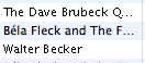
I don’t remember asking for that, but I suppose I did. And with the new release, iTunes changed from 10-point to 9-point. But what really made the ugliness obvious was the occasional antialiased line, like the Béla Fleck CD above. What’s going on there? John continues:
However, Jaguar introduced a change in text rendering such that Unicode text strings are always anti-aliased, in every application, no matter what your pref settings are. That’s why text with accented characters is anti-aliased, but plain ASCII is not.
Thanks Matt, and John. Preferences setting changed; all better now. :-)
Update 2: Yes, Matt Brubeck is a distant cousin of the famous Dave. What a delightful coincidence! I blog a weird problem, just happening to use a Dave Brubeck CD in the screenshot. And one of my blog readers (there aren’t that many!)—who happens to have the wherewithal to find out the answer to the problem—-is a relative.
As Duncan says: I love blogspace!