Keeping Track of Unimplemented Features
I started a new Rails project last week. The customer had done an unusually good job of working out the site look-and-feel ahead of time, so my first day on the project I grabbed the HTML mockup of the first page we were going to implement and turned it into a Rails app. It was still static HTML—6here was no code at all in the application, and no database yet—but the page was being rendered by the new Rails application. I carved the page up into a layout, main template, and appropriate partials, and got ready to start implementing features the next day.
But before I called it a day, I had an idea that seemed promising. I spent about 10 minutes (certainly not more than 15) going through that HTML looking for anything representing a feature that needed to be implemented. That meant links and buttons, plus anything that needed to be generated dynamically. Whenever I found something like that, I added a CSS class to the markup: “unimpl”.
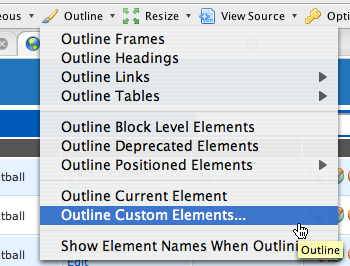
Then, using Chris Pederick’s Web Developer Toolbar extension in Firefox, it became a simple matter to quickly highlight all of the not-yet-implemented features in the application:
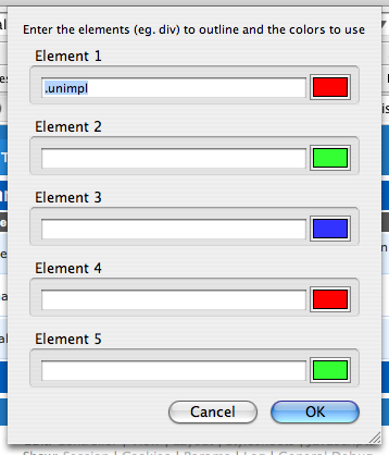
Just use CSS selector syntax in the dialog to select all elements with class “unimpl”:
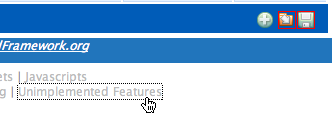
Here’s what the result looks like (demonstrated with the Streamlined sample application rather than my current project):
(By the way, those features are really implemented in Streamlined; I just marked that application up as an example.)
This provides a great, easy way of keeping track of things that remain to be done. As I implement those features, I replace static HTML with generated HTML, and I just delete the “unimpl” class as I go. Sometimes I partially implement a large part of the page; in that case, I move “unimpl” from the surrounding element to the individual pieces inside that I haven’t completed yet.
This is no substitute for requirements, or an issue tracking system, or anything like that. But it’s already proven very convenient as I implement features, trying to decide what’s next. It’s particularly nice when I have just a few minutes available … maybe not enough time to tackle a big feature, but I can quickly scan to see if there are any small things I could fix.
It takes just a little bit of discipline and consistency on the part of the development team, but it was really easy to annotate that first mockup, and now that the layout and commonly used partials are done, doing subsequent mockups will be even easier.
This morning I became annoyed by the three-click process to highlight those elements using the toolbar (how lazy is that?) so I hacked TextMate Footnotes to add a quick toggle link in the footnotes div at the bottom of the page:
If you’re interested in that, let me know. If it’s useful to people, I’ll polish it up and submit it for inclusion in footnotes.


